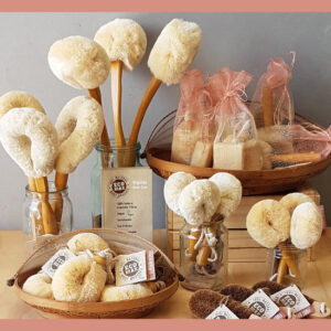
We know it’s not an easy job being a Retailer. There is so much that goes on behind the scenes. One hidden side of Retail is Visual Merchandising. Studies have shown that customers are quick at deciding if they will stay in your store and browse or leave.
In fact this decision can take as little as 10 seconds.
So creating displays that grab their attention is a real matter of ImportAnts.
Many of you may not know that my original career was as a Visual Merchandiser. I started working in a homewares store in the city of Sydney, did a Tafe course in Visual Merchandising, spent three years working for David Jones city store and then started my own display business working with retail stores and wholesalers. This all seems like another lifetime ago but it does put me in a good position to pass on some tips. So here goes.
10 tips to make those 10 seconds count
1. Keep your front of store displays fresh
You want your customers to see new displays that invite them in to look. So to make those 10 second decision positive, change your front displays regularly. But don’t think that this has to be only new items. Mix in some older pieces with some new pieces or even create a new display from items that you carry as a constant staple. It’s all about the theme.
2. Create themes for your displays
These can be seasonal themes like Mother’s Day, Valentines and Christmas. But themes can also be anything. Try doing a Zero Waste display for Plastic Free July or a Spring Cleaning theme with the change of season or even a Pamper Me display just because we all love a bit of pampering.
3. Lighting is important
A well-lit store is far more inviting and lighting used well can create moods that guide your customers through your store. Use spot lights to highlight your displays rather than just lighting the whole shop. Think about what colour of light you want to create what feeling. Warmer light can give a more homely feel and whiter light creates a fresher feel. Don’t be afraid to mix your lighting throughout the store.
4. Keep it simple
Don’t clutter your displays or your store. Pick the items you want for the theme but know when to stop. You want to make sure that each item relates and adds value to the visual impact. If you have too many add on sales items for your theme, continue the same theme to your counter display space for the smaller and less expensive items. For example with your Pamper Me display you might like to have lip balms, incense and soaps at the counter.
5. Use colour to set the mood
Pick a colour scheme for you display to set the mood and theme. Even a splash of colour as a vocal point in a display of neutrals can change the mood.
Red is lively, strong and powerful the colour of passion, danger, warmth and desire.
Orange is optimistic, fresh and healthy the colour of fun, youthfulness and energy.
Yellow is cheerful, playful and happy the colour of sunshine but also a colour of caution used for hazardous area as it is the most visible colour from a distance.
Green is natural and living, it represents the environment, sustainability and the organic world.
Blue is trustworthy, calming and reliable, the colour of the sky and sea, a cooler calmer space.
Purple is noble, spiritual and mysterious, more liked by women than men with lighter shades being feminine and nostalgic while darker shade are opulent and luxurious.
Brown is organic, grounded and honest the colour or simplicity, wholesomeness and naturalness.
Pink is often associated with the feminine, with pale pink representing sweetness but dusty pinks are sentimental think vintage and hot pinks are youthful.
Black is sophisticated, formal and luxurious it’s to be taken seriously and is powerful on its own and a create foil for other colours.
White is purity, simplicity and innocence the colour of minimalism, modern and clean.
Creating your display
6. Start with your largest item
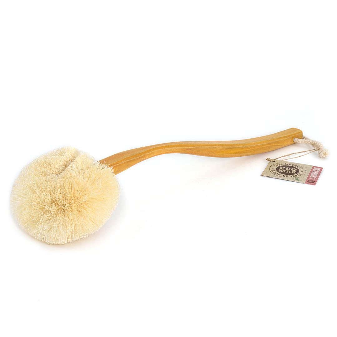
This item often is a prop but it could also be an item of furniture you sell. You can use items that don’t relate to the story you are selling. For instance a chair in amongst our Eco Max Brushes. For this display I chose a white chair as the only addition of colour in a display of brown tones. The white acts as a counter point and shows of the natural colours of the brushes. The white sets the mood as modern and clean and works well with the organic natural browns.
7. The rule of three
Odd numbers work better visually and are more pleasing to the eye. In visual merchandising three is never a crowd, it is perfect. According to eye movement tracking studies a group of three encourages the eye to move about and take in more detail. 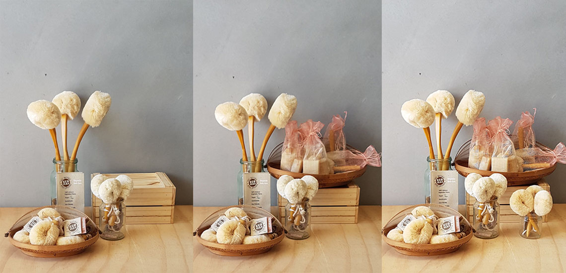
8. Asymmetrical, rather than a symmetrical
If you put a line through the centre and both sides are the same that is symmetrical. When creating displays asymmetrical in more interesting but you want balanced asymmetry so that one part is not heavier than the rest.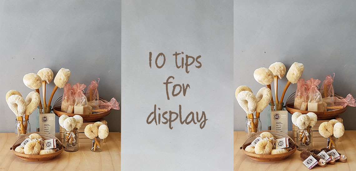
9. Lead the eye
A rule of thumb is to lead the eye from the outer edges towards the centre. The simplest way to do this is to work in triangles, or better still in three dimensional triangles, pyramids. Starting from your highest point work down and out creating a triangle form, then repeat in front with another smaller triangle. These triangles don’t need to be even sided remember point 8 balanced asymmetry.
10. Touchable & Simple
Don’t make it so tricky that the customer is too scared to touch it. Remember the whole point of your display is to encourage your customers to engage with it and buy so if it is getting messy quickly then it is working. It only takes a minuet to straighten a well organised display.
I hope these help you to create eye catching displays that make those 10 seconds count.
Eco Regards, Kim


